By: Garrett Bethmann
Artist’s Palette is a series in which we speak with the people who help shape the all-important visual side of the musical experience, from album and poster artists, to music video animators and directors, to stage designers and lighting technicians and everything in between. Music should look as good as it sounds.
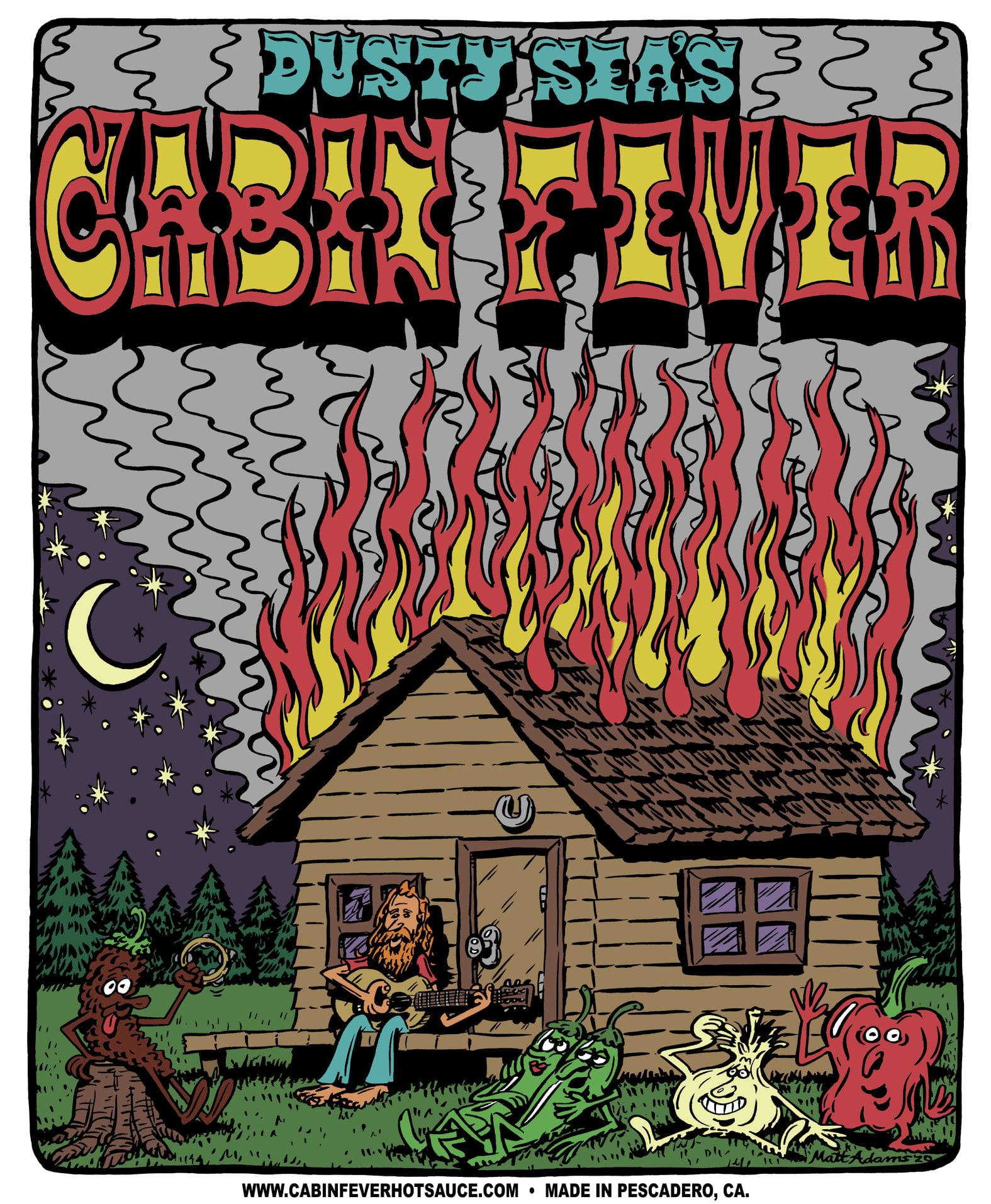
With his big sunglasses, bigger hair and shaggy smile, musician and artist Matt J. Adams looks like he’s ripped straight from the comic section of an L.A. counter-culture zine in 1971. Funnily enough, Adams has an affinity for just that type of dope-smoking, good-timing aesthetic and has embodied it faithfully in both the music of his lava-lamp pop trio The Blank Tapes and his personal art.
Adams grew up coloring, listening to The Beatles, loving Calvin and Hobbes and absorbing the artistic sensibilities of his family. He gravitated to all things music and art as a teenager, playing in bands, doodling around, sketching up posters when he or a friend needed to get the word out about a show. In his early twenties, Adams got to work with legendary cartoonist Bill Wray and had a hand in drawing bits for MAD.
Adams’ vibrant cartoons do have a certain MAD-like surrealism to them, though they are more spaced-out and smiling than the cynical Alfred E. Neuman. It’s a thrilling ride and you want to be stuck firmly into Adams’ version of the California experience, galavanting with a rowdy crowd of coastal hippies, psyched-out desert rats, scuzzy freaks bumming for a smoke and free spirits who are lost somewhere in a time loop between ‘68 and ‘73. It’s not satire as much as it’s a celebration of timeless weirdos.
(Full Disclosure: Matt J. Adams created Going Left’s logo and has done work for the author)
The company of clients Adams keeps underscore the psychedelic aesthetic that flows from his pen. He regularly works with Bay Area promotions company Folk Yeah Presents and hip L.A. live video juggernaut Jam in the Van and his art has been tied to work from Grateful Shred, Circles Around The Sun, Skiffle Players and a couple Chris Robison projects. The ultimate success came from working with the iconic Grateful Dead.
“For me, doing art for the Grateful Dead is a dream come true and it’s amazing to be, in some small way, a part of that legacy. Also, they have so many iconic characters that are fun to draw,” said Adams.
The ever-artistic workhorse, he keeps plowing along with his music, art and personal projects in our current era of Covid-19. With such a cohesive world of art and music stemming from the mind of Matt J. Adams, it’s easy to escape into his work, light a fatty and hang out for the better part of the weekend. Just don’t stay too long or you might forget what year it is. But then again, maybe that’s the point.

Read below for an email conversation with Matt J. Adams. This interview has been edited for length and clarity.
Do you think you are operating and using different creative muscles between the visual and the sonic? Is your creative goal different between your drawing and your music?
There are some similarities, but for the most part, I’m using different creative muscles. Drawing has always been more of a meditative experience with a nice pay off at the end when you finish your artwork. Although writing music can be somewhat meditative too, it can be more of a collaborative process recording and performing. As for the goal, most of my visual art is made for clients who request a certain kind of design so it can be harder to get my vision across. With music it’s usually always coming directly from me. I feel like I’m able to express myself more with music for now. My goals for the art and music are to create as much as I can while I can.
How’d you start getting into doing posters and prints? Did you ever initially think of it as something you could do in parallel with your music?
I started doing posters when I started playing live music as a teenager. I’ve always seen the music and the visuals as going hand in hand. Initially I made poster art just for me, and then some of my friends would start asking for some. But then I kinda took a break from illustrating posters for almost 10 years until a few years ago when I started getting some work. Then little by little, it became a full-time job.
Can you speak a little bit about the multi-step process you have to use to go from the first time pencil touches paper, to when you are sending it to the client as a finished project?
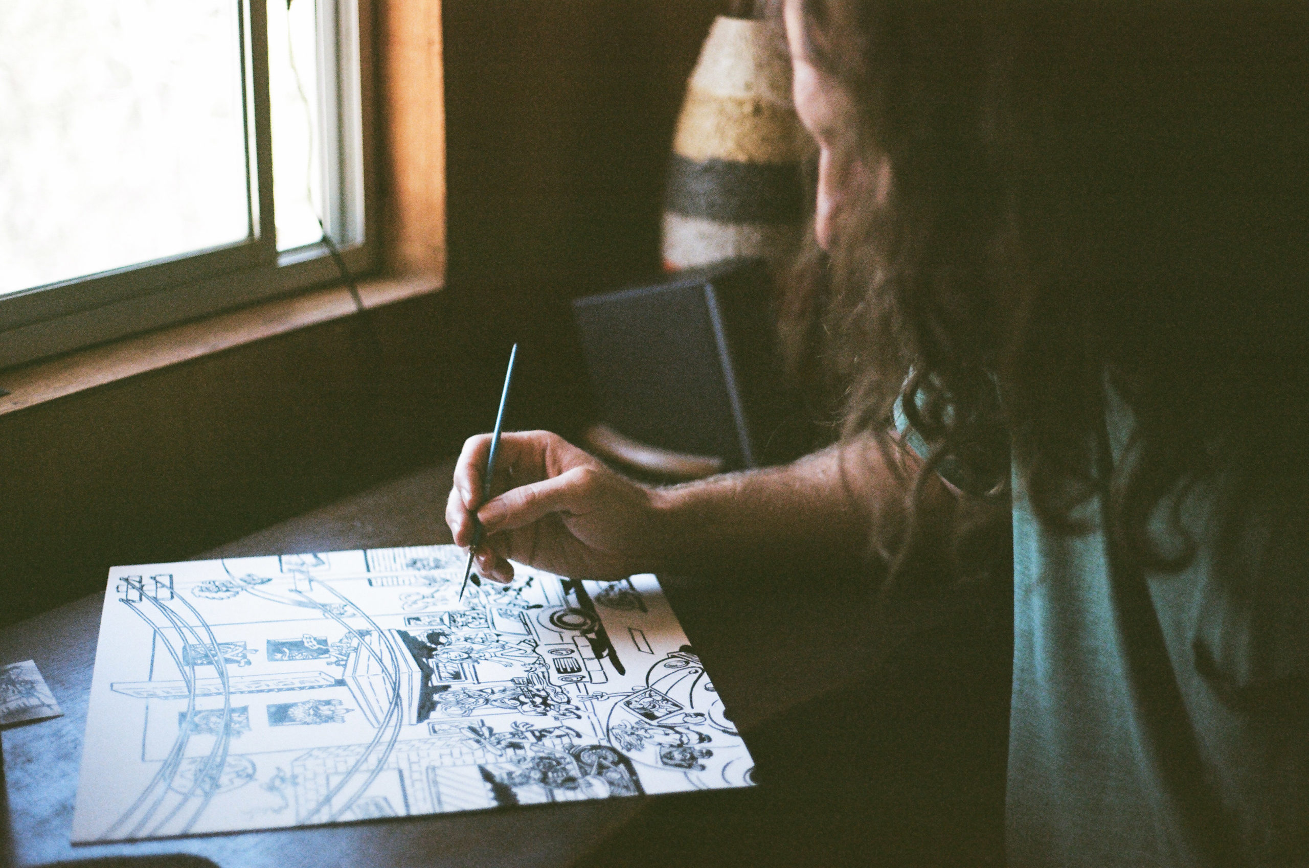
I sketch out some ideas in my notebook, and then when me and the client settle on a design, I pencil in the art on some thick paper. I make any necessary edits, and then ink in the art with a thin brush and some Sumi ink. I scan it or take a photo on my phone and then import the image into photoshop, clean up the image, and then add some color. It takes about 8-12 hours per poster depending on the detail.
What part of the process you mention above is the most challenging for you? Why?
The most challenging thing is when a client has a super specific vision, and then it’s my job to try to realize that. I’m usually up for the challenge, but I definitely prefer when I can run a little more wild with the imagery. For example, I somehow got wrangled into being an artist that draws people’s faces which is a big challenge for me. I’d much rather draw some big nosed, weird looking character from my imagination than to have to focus on all the subtleties of someone’s face.
What posters have you been really proud of lately? Why?
Hard to say, lately I haven’t been doing so many posters because live music isn’t happening as much. It’s always fun doing a Chris Robinson design. I like drawing poster and album covers for my band, I like the Levitation France one and the one of me riding a horse and playing guitar. The Skiffle Players “Skiff” album cover was a big one for me. Dan Horned kept pushing me to add more and more characters and details. It takes forever but drawing a bunch of weird characters in a scene or in an audience is always rewarding, like in the poster I did for Country Joe in San Francisco. I’m a fan of having some space in a design too.


