By: Garrett Bethmann
Artist’s Palette is a series in which we speak with the people who help shape the all-important visual side of the musical experience, from album and poster artists, to music video animators and directors, to stage designers and lighting technicians and everything in between. Music should look as good as it sounds.
Jack White is a Zeus-like figure in the music industry and Third Man Records in Nashville, Tennessee is his Mt. Olympus from which he reigns rock supreme, striking sonic lightning into the cultural consciousness at large. His musical origin is founded upon the titans of the blues that he’s so studiously evolved with raw intuition and his output has been the barometer for the state of rock music for the better part of 20 years. During that time he’s curated a bold visual point of view of elemental simplicity that has defined his overall brand, from the red and white of The White Stripes to the blue and white of his solo endeavors to the black and gold of Third Man Records. To say the man has a strong creative aesthetic would be an understatement.
During arguably Jack White and Third Man Records’ most ascendant period — from 2015 to 2019 — Caitlin Parker was a part of the in-house design team that was tasked with bringing White’s strong creative aesthetic to the world. A chance meeting at a bar with another Third Man designer brought the recently graduated Parker in front of the company’s distinguished department head Nathanio Strimpopulous. Seemingly impressed with her work in printmaking and strong sense of composition and typography Strimpopulous brought her onto the team, forgoing the usual process of White interviewing and approving all hires, underscoring how much of a natural fit Parker was for the company and the potential she could have in the company’s growth.
She worked on album concepts for big name Third Man Records artists like Margo Price, Lillie Mae, My Bubba and Teddy and the Roughriders, always looking to blend the holy trinity of artist aesthetic, label aesthetic and personal aesthetic into a captivating product. Her signature accomplishment during that time was creating the surreal album cover for White’s most recent and eccentric album, 2018’s Boarding House Reach. Snagging an album cover as bewitching as Boarding House Reach is as close to timeless as you can get from a design perspective in the music industry and people will be admiring Parker’s art as long as the music is being played.
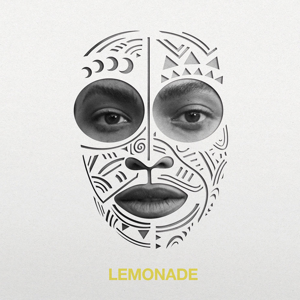
She was also involved with producing a limited box set for Beyonce’s Lemonade, maybe the most revered person in music — the ultimate Aphrodite-meets-Athena-goddess-figure — releasing her most universally acclaimed masterpiece. Wild concepts for the potentially historical release included lenticular covers and actual lemonade packets, though unfortunately the project was eventually scrapped for costs.
Working for Jack White and swapping texts with Beyonce for Lemonade art concepts is quite the first job out of design school, a rarified experience Parker not only learned from but excelled at. Now as a freelance brand designer based in Richmond, Virginia, she’s always incorporating the storytelling aspect of design she learned from Third Man Records into her projects. It’s a moment in Parker’s burgeoning career she remembers fondly, one that left an indelible mark on her, just as she did on it.
If Third Man Records is the house that Jack built, Caitlin Parker is one of it’s most accomplished interior designers.
Read below for a conversation with Caitlin Elizabeth Parker. This interview has been edited for length and clarity.
You went to design school and have been exposed to the way a lot of different industries like to use art and advertise with it. Do you see something specific in the way musicians and artists create or use their art that is typical of this genre of design?
That was one of the biggest learning curves. The quick answer is there really is no one unifying quality that I can describe. It really just depends on your personal style as designer, the musician’s personal style as an artist and what they want to convey and the style and aesthetic of the label, like Third Man. How do I approach each project and make it something that reflects all those elements? Sometimes it was a typography that reflected the label’s aesthetic and mine was brought in with the image treatment in Photoshop and the artist’s perspective was brought in with their own images or art, or whatever the happy blend was.
What were the specifics of putting together the Boarding House Reach album cover and how they incorporated those design principles you just mentioned?
All of those things I just said went out the window when working with Jack (laughs). It was an interesting process because we as the design team weren’t even allowed to listen to the album for the first month or so of the process. He came in and told us he was doing an album and he wanted to release it in about 3 months, and a typical release takes 6 to 9 months (chuckles). He didn’t have a specific vision for the art and he wanted to see 10 to 15 design concepts of front covers from each of the designers and we had five designers at the time. But, he’s a visionary, and that’s how it goes! He may not have known exactly what he wanted, but he knew that he’d know it when he saw it (laughs)!
At the time, it was a challenge because we had 20 other projects in the queue and we had to put all that aside for a week to focus on this release. At the same time, however, that’s when we really got to flex our muscles as creatives, because that’s when we really got to explore, push boundaries, and go free with the art and design. It was the most challenging but fun project I’d ever worked on.
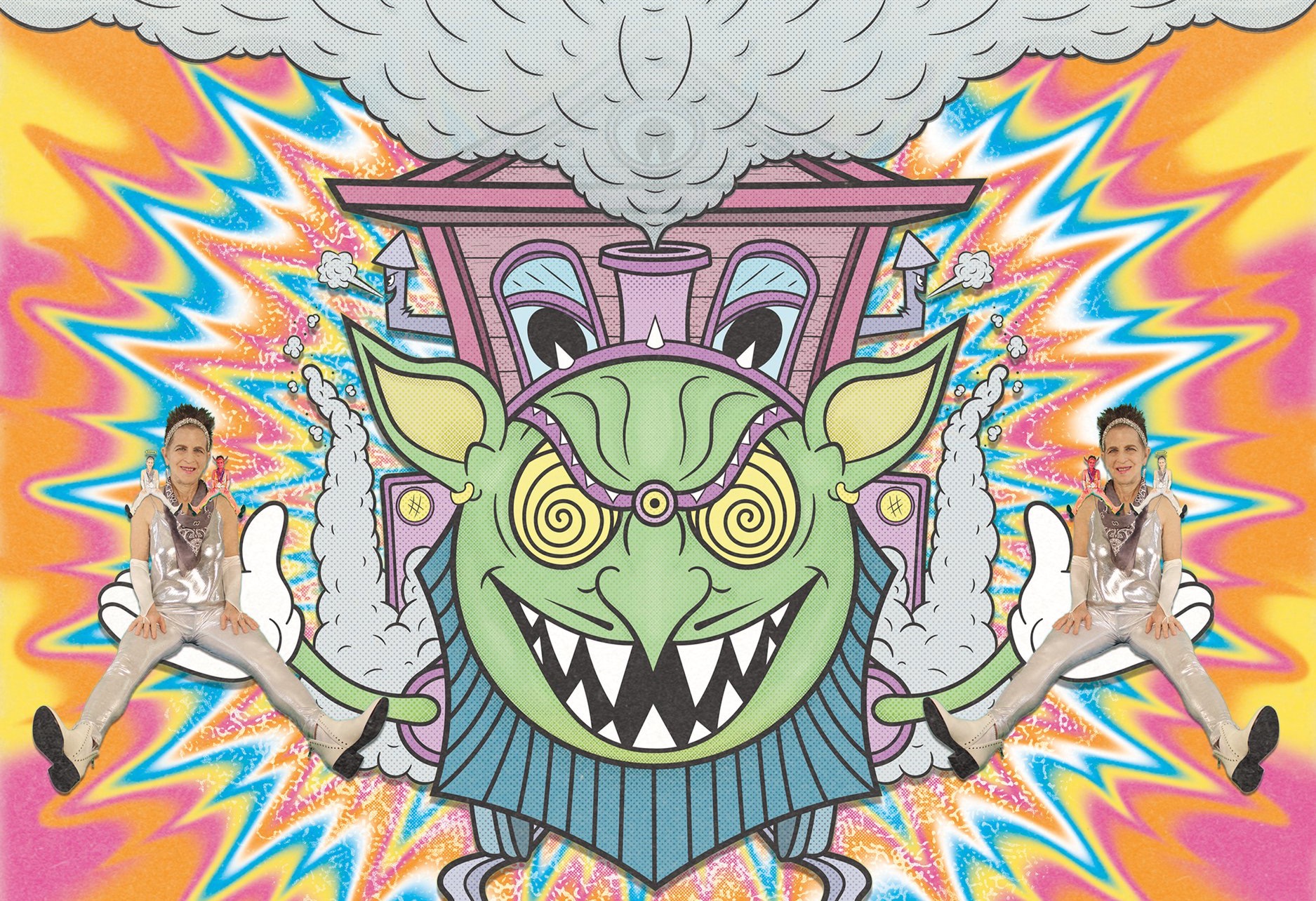
We went into his office and we didn’t even really go through whole explanations of what we were going for, it was all sort of half-baked at first. He got to one of the ten compositions I presented and something must have stuck with him about it. It was very different from what it looks like now, with the woman’s face covered in clouds. To me, it was sort of this “God is a woman” idea and he gravitated towards that. He kept coming back back to it and finally was like, “What if that is my face, but the clouds don’t hide it?”
So we spent three weeks working and tinkering with this concept, and I think the final ended up being five different photos of his face, blended with the lips and figure of the woman. It looked surreal, and ended up being one of my favorite pieces I’ve ever done. Afterwards, he went back through and was like, “We’ll do that for the front cover, this for the back, and how about this for the interior?” These concepts make no sense together, what are you doing (laughs)?! But, ultimately, he had a vision, and it worked! The final version looks great, and the blend of influences in the art really reflect the blend of styles in the music on the album.
I also want to talk about Lemonade and your involvement with that.
That was album art for a special edition box set that was never produced because of cost. When they worked together on that single, Jack talked to Beyonce about releasing it on Third Man. She was really receptive to it and she has one of the most incredible, impeccable design teams of all time (laughs). Same thing happened as Boarding House with the time crunch, but we had a lot to go off in terms of the art and music.
My friend Ryan did one that was lenticular, where you tilt it left and right it changes the image, it was crazy. Another one was an actual pouch full of lemonade. We went through a few rounds and refinements and she was personally texting us and telling us it was awesome, but we had to cut it because of costs.
Jack White is such a larger than life figure and there’s surely multiple facets to his personality, especially when you think about professional versus personal relationships. Where did you find he was personable and relatable and where did you find he put up his walls?
The coolest thing is what makes him the most excited, personable and relatable is when he’s talking about music. His music, old music, the music that drives him, he just loved to geek out. He has the most niche knowledge of blues legends, I couldn’t follow him (laughs).
When it came to day-to-day management I think that was when he went back into his shell a little bit. He’s so focused on his art, so managing the in’s and out’s of the day-to-day business was more left to his partners and label co-owners. It makes sense, at the end of the day, his main job is being an internationally touring artist!
What do you think you bring to the table now in your work that wasn’t there before working for Third Man Records?
Not only did I learn from working there specifically, but that was my first job out of design school, so I learned so much about my own craft and processes. I think the storytelling aspect of what I do is what I took most from there. I had to really learn that because there was a time in the beginning of my career where I wasn’t sure how to approach a project.
They don’t tell you to blend all these things together, you have to figure out how to approach this huge project and make it successful and please everyone involved. What I learned was the best way to do that is to put my own design preferences and my management’s on the back burner and get into the core messaging of what the artist wanted to say, then come back later with our designs. Now I mostly work in branding and I use this storytelling all the time.